Last week we took a look at the mock-up of Melbourne’s new train design, to give feedback to the project team.
The mock-up is one and a half carriages, designed to show stakeholder groups the layout, including the inter-carriage connections.
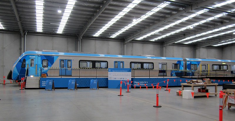
The platform alongside the mock-up has different heights, to simulate actual conditions around Melbourne’s rail network. This model of train will initially run between Sunbury and Cranbourne/Pakenham, but eventually will run on other lines too. (We think the front destination sign is very clear, but not so readable from an angle as the train approaches the platform.)
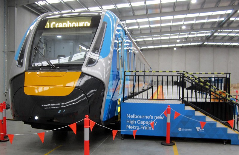
Ramps are also in use for testing with accessibility groups. They are testing different highlights around the doorways to assist people with vision difficulties.
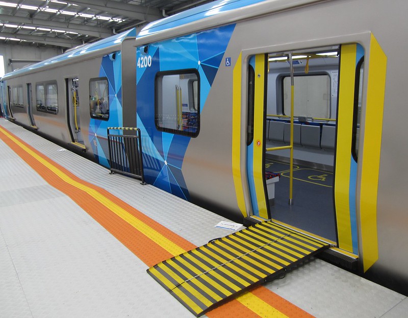
A “gap filler” is being tested, attached to the doorway of the train. We’re a bit concerned that this is rubbery, and may move under-foot – it’s also incompatible with similar devices on some station platforms. The external passenger assistance button is also only a test, and may not be on the final trains built.
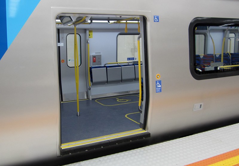
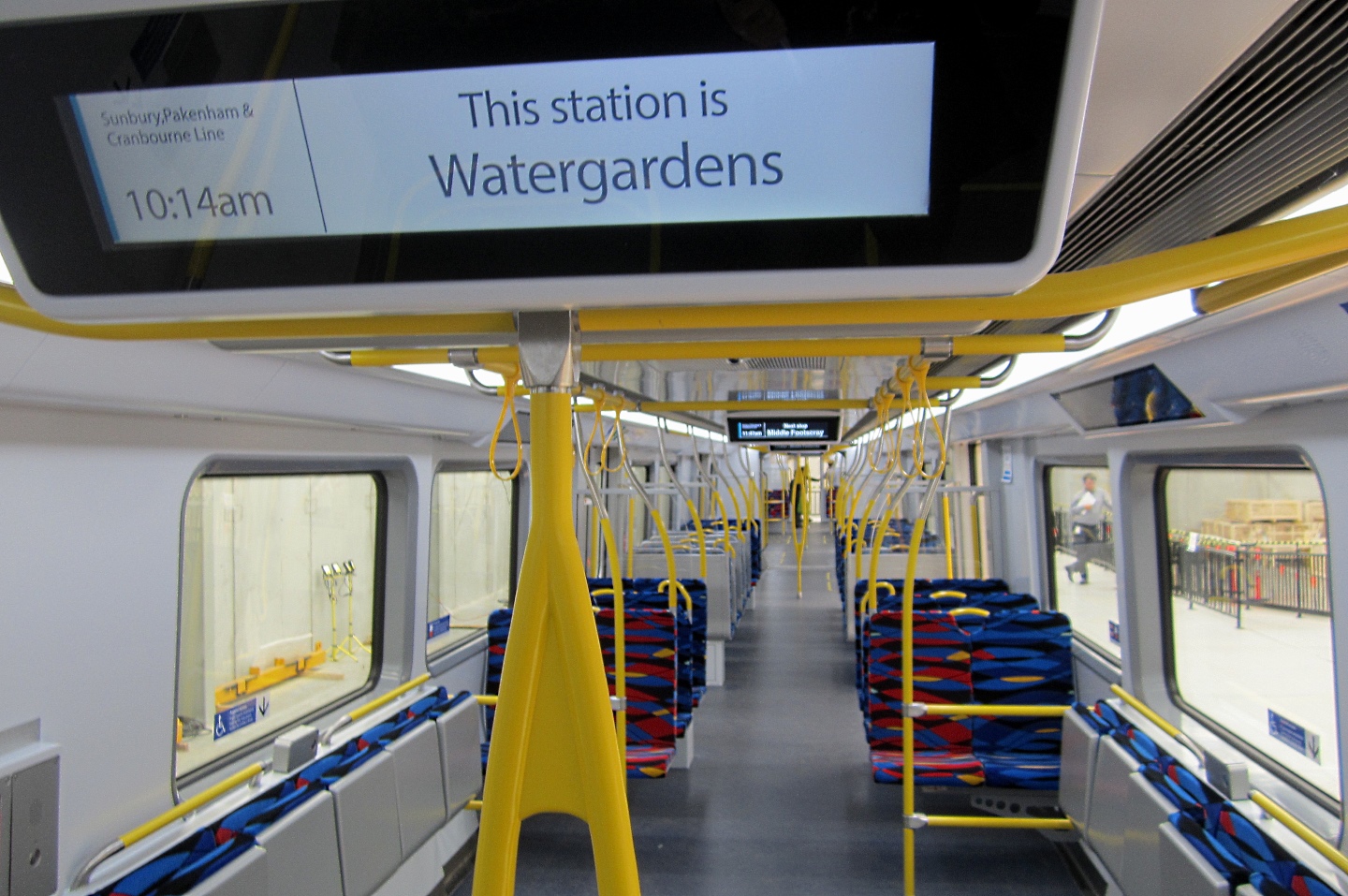
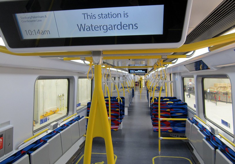
Inside, there is open space near the ends of the carriages, providing allocated spots for wheelchairs. Happily, the hand straps in the standing areas are soft, and don’t squeak like on the Siemens trains.

The middle sections of the carriages have a lot more seats. The total number of seats in the 7-car train will be about the same as the trains in the current fleet. The mock-up has more places to hold (rails and hand straps) on than on the Comeng and Siemens train, but we think there could be even more provided.
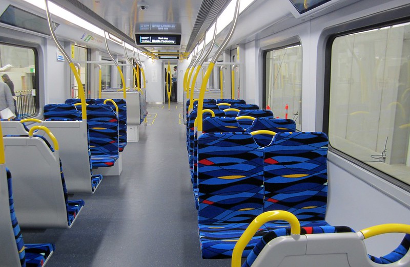
Above each doorway is a “Passenger Information Display” screen showing the next station and other information. They’re trying out different designs, including colour, and white on black (which isn’t as “pretty”, but is much more readable).
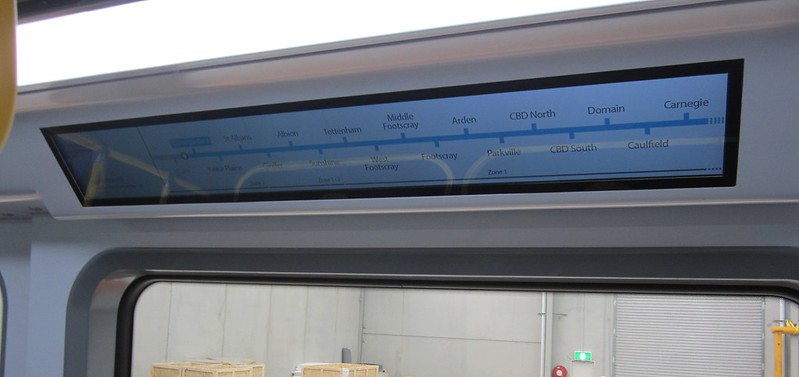
The inside walls have a “dynamic route map” showing the route the train is taking, and its current location. Of course these will have to be more reliable than the current fleet.
A display on the outside of the train also shows the destination. This is more readable than similar displays on the X’Trapolis trains.

Overall the mock-up looks pretty good to us, but we’ve provided some feedback on areas where we hope to see improvements in the design, as have other groups.
Anything you see here may have changed by the time the real trains start service.
Here are some more details of the mock-up, provided by the government:
The High Capacity Metro Trains Project is currently two weeks into the final train design consultation phase, which has been running all year.
14 accessibility groups, 3 passenger groups and technical experts are all now evaluating the mock-up train.
The High Capacity Metro Trains Project ran a passenger simulation exercise a few days ago, where almost 100 members of the public were brought in to experience the mock-up.
On 3 October, Guide Dogs Victoria were evaluating the mock-up – including their suggested change for more flip down priority seating as guide dogs are trained to sit beneath their owner’s seats.
Passengers, accessibility and transport user groups have already provided feedback on features such as the doors, seats, lighting, electronic signage, straps, and handrails.
More than 600,000 Australians currently use mobility aids and the design of the High Capacity Metro Trains has factored in their need for more space for mobility devices, including scooters and wheelchairs.
The final number of seats is yet to be determined and will be decided once the extensive stakeholder consultation that is underway concludes – however, the new trains will have more seats than the current fleets, which have between 420 to 432.
The feedback from stakeholder groups will be consolidated at the end of this evaluation phase, with the train design to then be finalised over coming months.
- What do you think? Leave a comment on Facebook
- Help us represent passengers – join the PTUA!
