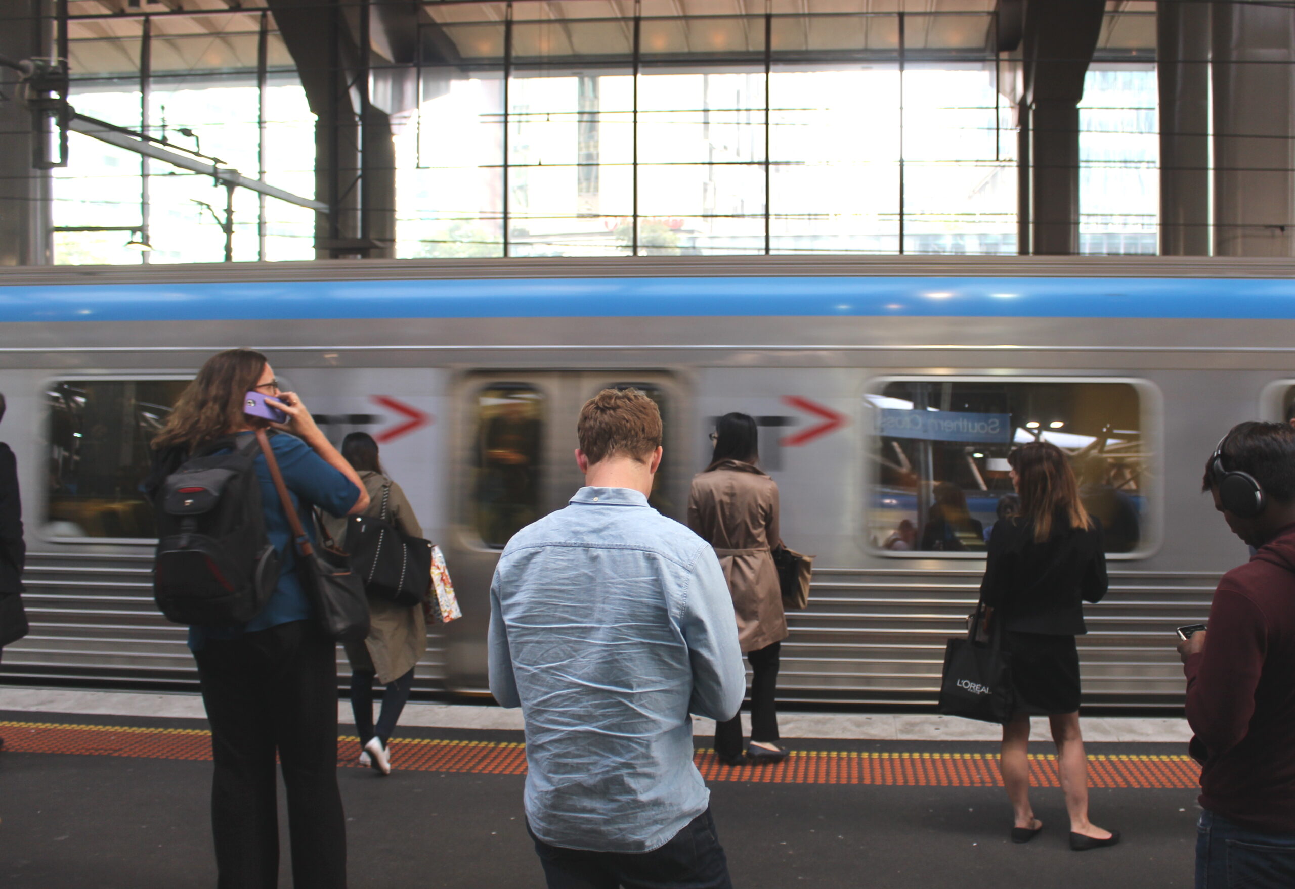
As the rail network gets busier, it’s important that stations be designed to assist the efficient flow of people.
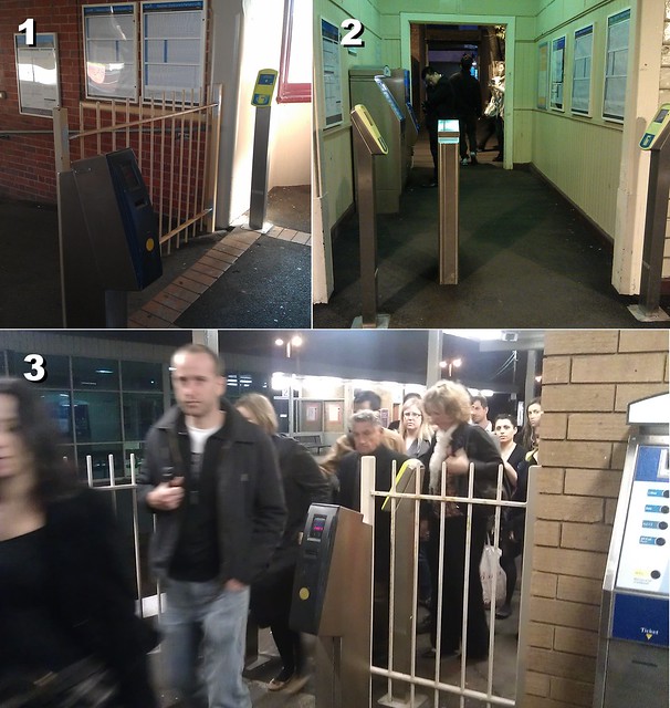
The current design of some railway station exits, and the placement of Myki readers simply doesn’t make sense.
1. Armadale station — this reader is well out of the way, a long distance from where passengers enter the paid area.
2. Murrumbeena station — one reader has been placed almost in the middle of the left-hand side of the exit, leading passengers to squeeze past it at busy times.
3. Bentleigh station — this platform is not commonly used, but when it is, there is a bottleneck to exit, made worse by some passengers having to touch-off their Myki cards.
PTUA members: check your copy of the July 2011 newsletter to read about the government’s new Station User Panel, and how you can pass your feedback to the PTUA’s representative on the panel.
More about PT Problem Of The Day, including how you can contribute your photos.


